Well, it's finally here. They said it would never happen, but Scrivener for iPad and iPhone is finally being released to the Apple App Store on July 20th, priced at twenty US dollars.
I've written extensively about the differences between different pieces of writing software for both the Mac and iPad over the last year, in blog articles that brought me a fairly enormous number of hits (start
here, then go
here, then
here, then
here and, lastly
here). The ghost hanging over all of those discussions, primarily focusing on the desktop version of Scrivener and its nearest rival, Ulysses, was the long-awaited Scrivener for phone and tablet. It seemed for a long time as if Scrivener had been long overtaken and even superseded in the mobile market by Ulysses and Storify, which each synced between their desktop and mobile versions via iCloud.
Scrivener was still the acknowledged King of writing software on the laptop and desktop, both PC and Mac, but there was a constant demand for a mobile version that some came to believe would never appear as year passed after year. Even just two days ago, I received an email from someone asking about alternatives to Scrivener they could use on a mobile device. They hardly believed me when I told them a mobile version of Scrivener was, at last, imminent. I explained I had in fact been beta-testing Scrivener on my iPad for the last two months.
I'm not going to go very in depth regarding the specific workings of Scrivener for iOS, because there are already a whole screed of blog posts and reviews detailing them, and you can get more of a downlow on what it looks like and how it works direct from Scrivener's makers. Instead, I'm going to talk about how it compares to what else is out there, and how it's affected my own workflow as a working writer and writing teacher.
So please don't think I'm being bombastic when I declare that Scrivener for iOS is, quite simply, a game-changer. In those two months, I've written the entirety of a second draft of a novel on my iPad. In some respects, Scrivener for iOS is even better than the desktop equivalent.
The reason for this goes back to what some perceive as the relative complexity of desktop Scrivener. It has a lot of bells and whistles, although rather than being bloat, these are absolutely necessary features. However, not everybody needs all those bells and whistles, and some people, coming fresh to Scrivener, can apparently feel a touch overwhelmed by it. I think that's a shame, because at heart it's a beautifully simple concept: you can have a page of text to be written or edited, and around that page you can arrange as much ancillary information as you need, from moment to moment: character and story outlines, illustrations, story notes, rough ideas, other parts of the same novel-or-work-in-progress for reference, sheets of reference material, and so on.
It also still carries at its heart the basic principle that unlike the 'What You See Is What You Get' principle of programs like Microsoft Word, which present you with a representation of an actual printed page, Scrivener (and other programs like it) take a more pragmatic approach where the appearance of the text is set only at the final output stage when you create either a text or ebook file or PDF. Until then, you have absolute control over the colours of the screen, the different windows, and the text. You can have inline annotations that print or don't print, and so forth. But at the heart of it, what you get is whatever piece of text you're working with, plus a few notes in little windows you can move here and there around the screen and arrange any way you like, along with an outline or two, a reference picture in one corner, perhaps, so that as your eyes flick between the work in progress and all that ancillary information ,you get to see exactly what you need from moment to moment.
Contrast that with, say, Microsoft Word, where you might have to endlessly scroll through several different documents, switching between different programs and so forth to find the information you need from moment to moment. Microsoft Word was built for writing business letters, not novels, and it shows.
 |
| Image 1 |
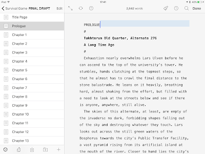
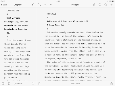
Image 1 here shows you Scrivener on an iPad Air: the opening of my new book is on the right, while a list of chapters is on the left. Image 2 is the same, with one change: I can view, edit and scroll through the following chapter (or any other) in the bar on the left (which can, if necessary, be expanded). It could also be notes, or expanded information about the chapter, and so forth.
Scrivener for iOS, however, by necessity, is a more stripped-down affair. In that respect, it answers the need by some for a simpler approach. Indeed, I noticed while reading through comments on a beta-testers thread that some liked the idea of being able to use Scrivener for iOS on their desktops, seeing it, essentially, as a 'Scrivener Lite'.
 |
| Image 2 |
Although there are good reasons why that isn't possible, it's been clear to me over the last couple of years that laptop computers may eventually give way to tablets equipped with keyboards. Indeed, I find my iPad Air and Microsoft Universal Keyboard exceptionally easy to work with - I'm writing this blog post on it at the moment. Scrivener for iOS may offer that "non-threatening" alternative that might draw new users in.
What really matters, however, is that it's essentially impossible to fault Scrivener for iOS. There are a couple of things it can't do the desktop version can, and while it's worth remembering that this is only the 1.0 version of the software, meaning future iterations may be able to do more, at the moment those areas in which it might be perceived as lacking are areas most users aren't likely to have much use for.
It offers the perfect paradigm for writing in. The right of the screen is occupied by text being worked on. The left contains a wide bar in which can be viewed a list of chapters inside a draft, or the contents of each of those chapters, or indeed images and notes from other parts of the "project" within which you're working.
When I first started comparing Scrivener with Storyist and Ulysses, the field of combat, as it were, was much more even, although Scrivener ultimately always proved to have the edge, particularly when it came to novel writing. Now, however, Scrivener, with its new incarnation for iPhone and iPad, has pulled far, far ahead of the competition. It is, simply, unrivalled. I am not joking when I say I find the process of writing on my iPad, using Scrivener, quite addictive. It is as near to a perfect writing tool as I've yet encountered.
If you have a desperate need to write in Markup, then Ulysses remains your tool of choice, and it syncs well on both Mac and iOS via iCloud as well as having an excellent interface.
However, in direct comparison, the limitations of Ulysses for iPad, compared to Scrivener for iPad, become obvious. In Ulysses, it's possible, but more difficult, to see information related to the main text you're working on. Notes are always linked to a specific document, meaning if you're working on some other document and went to see those notes, you either have to copy them over to the current document or keep going back to that other document, which is terribly aggravating. Similarly, even if a note is to hand, viewing it pulls out a window that obscures the main text window on the iPad. That makes it impossible, say, to work on one text document, while glancing to the side to compare what you're writing with your notes.
This, by contrast, is stupendously easy to do on Scrivener.
So if markup text isn't of overwhelming importance to you, and you like the idea of using your iPad or even your iphone as an actual work tool, then Scrivener, for the great majority of writers, is indeed an absolute game changer. Really, I don't think it could get better than this.
So my final, final, final, final word on writing software, in the specific context of the iPad is: forget the rest. Scrivener is now, officially, the two-ton King of writing software on the iPad, and very probably on the desktop as well.
 And hot on its heels, here's another sexy little number that sashayed its way into my hands: a physical copy of Scottish sf magazine Shoreline of Infinity, and a proper luxurious little number it is, especially given it contains my most recently published short story, Senseless. You can of course get it here at Amazon, or direct from the publishers if you prefer, in ebook as well as paperback format.
  And hot on its heels, here's another sexy little number that sashayed its way into my hands: a physical copy of Scottish sf magazine Shoreline of Infinity, and a proper luxurious little number it is, especially given it contains my most recently published short story, Senseless. You can of course get it here at Amazon, or direct from the publishers if you prefer, in ebook as well as paperback format.


